How to Create a Balanced Color Scheme
Last week, I introduced you to the color wheel and how it is used it to create harmonious color schemes. The next step after deciding on a color scheme is applying it to a room design. Balancing those colors around the room will lead to a successful design (We are just dealing with color for now).
This is not easy to explain as balance is visual. I usually step back or take a picture of my space to make sure it is balanced. But, one thing is for sure, YOU WILL KNOW when your room is not color balanced because something will seem off. I am going to try and explain this to the best of my ability based on what I learned in school and through my limited experience. 
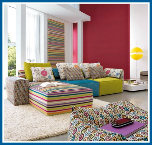
Pick a room in your home and name the first two or three colors you see. This should take you about 10 seconds, any longer than that means you have too many colors. Not that there is anything wrong with having too many colors, but it is a true challenge to balance multiple colors in one room. Designers agree that more than five could lead to a busy look if not done correctly. At first glance, the color scheme in the picture below is a triad of blue, yellow and magenta. However, the multi-colored patterns seem to over power the other colors. The colors are balanced but the look is busy (at least in my opinion.)  Personally, I recommend 2 or three colors in one room.
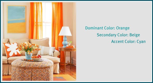
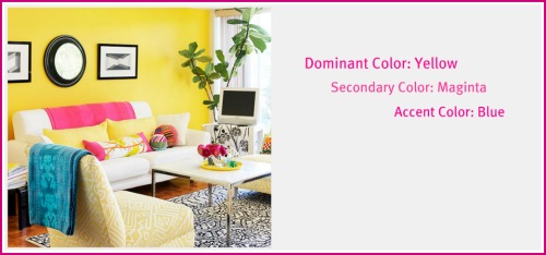
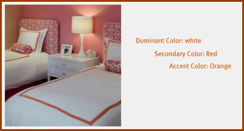
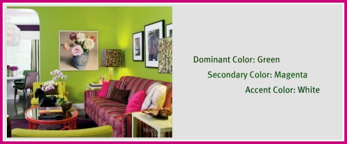
In order to create color balance, you have to distribute the colors around the room according to the 60-30-10 rule . This means that the dominant color occupies 60% of the room. The secondary color occupies 30%, and the accent color occupies 10% of the room.
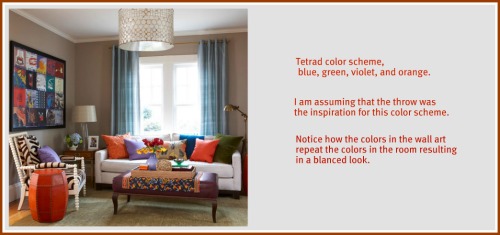
Here are some examples from BHG to help you visualize the balance,
As I said in my previous post, neutrals are not considered colors but they are extremely important in achieving a balanced look. They can be used to tone down colors in a room. Depending on the amount of neutrals used, you can have a subdued look or a vibrant look (ignore the intensity of the colors this time). For example, in this bedroom picture, the use of white is more than the red and orange, which gives the room a subtle appearance.
However, in the picture below, minimal neutral is used and so you end up with a vibrant color scheme.
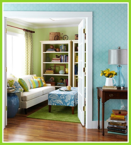
One last important point to pay attention to is the color flow between rooms. Especially if you have an open floor plan, it is important to connect the rooms together with coordinating colors. In the picture below, blue accents are incorporated into the green room to tie the two rooms together. The colors represent an analogous color scheme of blue and green.
I hope this was more helpful than confusing! Achieving balanced color schemes can be a challenge but it can be done with a little patience and a lot of experimentation. 
What color scheme do you have in your home?
Until Next Time~

