How to update interiors with colored wall paint
Welcome back my friends! I hope those of you who celebrate Christmas enjoyed a great day with your family and friends. I enjoyed having my family around to babysit while I worked in the mudroom. 
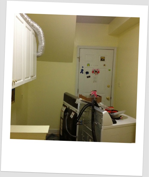
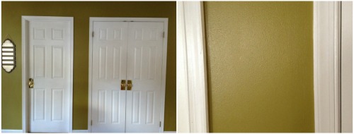
One of my design goals for the mudroom makeover was to create a cheerful and inviting back entry into the house. Last week I took the first step towards accomplishing that by painting the mudroom walls. Thankfully, it came out as I had imagined….cheerful! Choosing the right color for your walls is a challenge, but it can be done if you know where to start. This is what I recommend you do to update the look of a room with colored wall paint.
1. Don’t go to paint stores to search for a color because you WIILL BE CONFUSED! First decide on a color, and then search for the right shade of that color in paint stores.
In the case of my mudroom, several factors affected my choice for wall color. First, it should coordinate with the green decor that I already had prior to this makeover. Next, it should flow with the kitchen green wall color. Finally, it should brighten this small , windowless room and generate an inviting feeling. As a result, I decided that Yellow would be the perfect choice because it is cheerful, bright and coordinates with green.
2. Now that I have decided on yellow, I could start my search for the right shade of yellow for the mudroom walls. I went to Home Depot and examined the shades of yellow under Behr brand. Since my mudroom is small with no windows, I looked for a light shade of yellow to visually expand the space. I found three that might work and I purchased a sample of each (Frosted Lemon, Butter Yellow, and Havana Cream)
Note: Always purchase a sample! Light affects the way we see color, so the color you see in the store will not be the same color you see in your home! Therefore, to be certain that the color you like will look great on your walls, purchase a sample!
3. Once home, I painted a medium size rectangle on each wall of the mudroom. This gave me a clear idea on how the color would look in the room. If you do not want to “mess up” the walls (just in case you don’t like any color, and you decide to postpone the idea of painting until next year) then you can paint a white foam board. You can purchase that from Michaels craft store, paint it, then hang it on the wall to observe the color throughout the day.
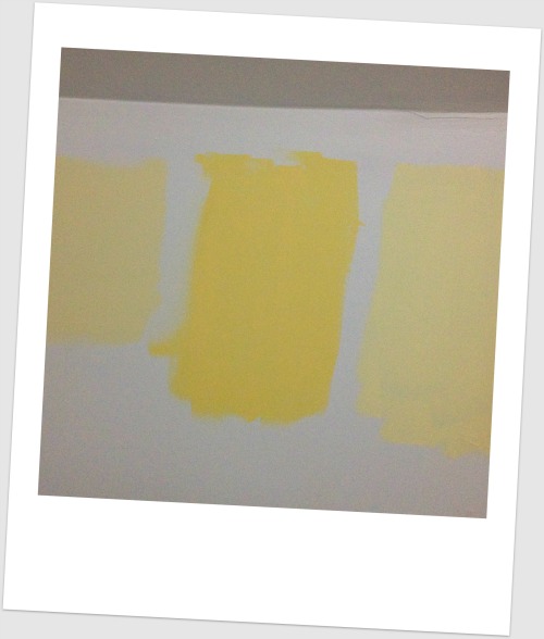
Below are my three yellow paint choices. After observing them for 2 days, I decided that one was too yellow, the other too dark and the third was just perfect. Can you guess which one I went with? I will give you a hint, it looks creamy. 
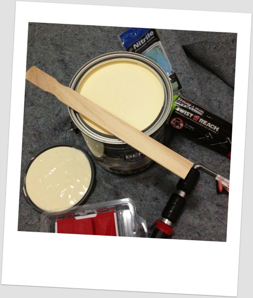
4. Confident in my choice, I went back to home depot and purchased a gallon of the Behr frosted Lemon in a semi gloss finish (for durability) pre mixed with primer (which would reduce the number of coats to ONE) 
5. Next, I spent half an hour in the paint brushes/rollers isle looking for the right roller!! I did not imagine the variety of options out there! Thankfully, the people in Home Depot were very helpful and explained the different kinds. I was able to find a roller that would not drip, would cover large areas and would help me get the job done fast! I also bought an edging pad that would make painting the edges easier.
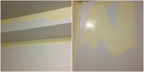
6. With that done, I was ready to start painting the walls. I began with the edges using the edging pad, then I used the roller to fill in the rest. I rolled a w or v shape as I was painting until all was done.
7. Two hours later, I was done! It was not difficult or complicated, just time consuming but rewarding. I was so happy to see that the color I chose was exactly what I was looking for. Cheerful and bright!
Note: There are several paint specialists like Sherwin Williams who provide you with the option to “see” the colors on your walls using a color visualizer. You can upload a photo of your room and experiment with different color choices. I like this because it gives me a starting point for my search for color.
I used this service when I was looking for a color for my kitchen. By the way, the color I chose through the computer looked nothing like its counterpart in the store. But, I loved the way it looked in the color visualizer. So, I bought a sample and observed the color for a couple of day before I decided to use it. It came out amazing, don’t you agree! Its called Brassy, which is a green color with a golden yellow undertone.

